Introduction
Fonts and typography are a domain that has always fascinated me. Everyone knows that the pen is a much stronger weapon than a sword. The message you want to give to people is very important. But always, when writing, you cannot do without letters. And here we go with fonts and typography.
Should you make it handwritten? How exactly should the letter A look? Should you go for a classic book-like font? Or opt for some modern Google sans-serif? Or will we go back to some old type from the Middle Ages, when only monks were writing?
The answer depends on the style of the message. I talk about branding a lot on X, and this is exactly one area where you can be very specific. What’s your “business message”? That runner from Athens ran 42 kilometres, then he arrived in Athens, said “We have won!”, and died.
What’s your message? What are the adjectives you would use to describe it? What’s the one main adjective you want people to use to describe you? The more aware you are of the face of your brand, the better. Then, when you have this “personality,” you can choose the font.
This is the beginning; now let’s dive deep into all of this.
A brief history of fonts and typography
We begin with the Egyptians’ hieroglyphs—a very special kind of type known as image type. In today’s terms, think of emojis. The Sumerians’ cuneiform was also quite distinctive. Both of these scripts, especially the Egyptian, were primarily used for religious and ritual purposes.
Our typographic tradition originates from the Phoenicians, the first known “business people,” suggesting that from the outset, our type was business-oriented. This formed the basis for Greek and Latin scripts, which we use today (unless you’re Chinese, of course).
The revolution began with Johannes Gutenberg and his development of movable type. During the Middle Ages, there were two major fonts—Carolingian minuscule and Roman Capitals.
Since then, the creation of many fonts and the rise of digital typography have propelled this entire industry to stellar heights.
Four main categories
Now we can talk about four main categories used for texts:
- Serif (Antiqua)
- Sans-serif (Grotesque)
- Script (written type)
- Blackletter (not so famous, kind of “Middle Ages” type)
The most readable/legible is serif, which is used extensively for longer texts, especially in books and printed publications. It features decorative strokes that we have from Roman times. Use this for the classic and more established look.
Sans-serif (literally “without serifs,” which are those strokes on the endings) is primarily a digital type, I would say (very popular in web design). Many sans-serif Google fonts are used on the web on millions of sites. This is the simplest and cleanest type of font we have. Use this for business and a modern look.
Script is used when you need some more artistic expression. It’s not suitable for a lot of text. This calligraphy style is used, for example, for signatures. Some fonts in this category were inspired by the type of a real person, while others are just made up.
And then there’s blackletter, very decorative, sometimes used in books for the first letter of a chapter. You will probably not use this on the web if you’re not making websites for artists.
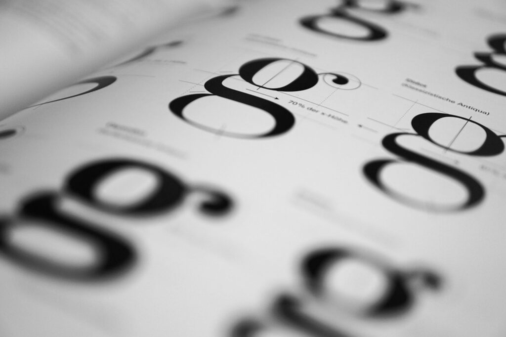
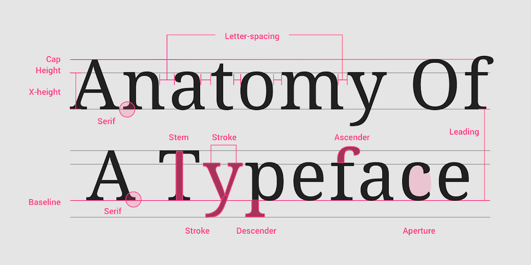
Anatomy
We could also discuss the entire anatomy of fonts, but I will not mention it much in this text, as I don’t really think you need to know this to be successful in life. Here is the image with all the names of strokes, etc. – look for yourself.
5 principles you should know about
Font:
You probably understand that this is the most important aspect. Which font should you choose? There are so many possibilities. You can do two things: spend hours trying different fonts and playing with what works and what does not. This is a lengthy way, but in the end, you will gain a lot of experience and it will significantly advance your skills. The second option is to explain to ChatGPT what you are working on and let it recommend some fonts. This works if you want a quick solution.
Once you have chosen a font, you can do many things. You can change the space between letters, the space between lines, and how bold you make them. All these adjustments are very important and can significantly alter the appearance of the type in the final result. For longer and smaller texts, remember that readability is the goal; you can be more creative with shorter texts and headlines, for example.
Hierarchy:
One of the three most important aspects in web design. When you have a large block of text, you should include some headlines as well. This means some text must be smaller and some larger. We have several options to make some text more prominent: you can make it either bigger, bolder, underlined, or change its color. Try to be consistent with headings – all H2s should look the same, all H3s should look the same, etc.
Alignment:
This is crucial. The easiest text to read is aligned to the left. When you have a large block of text, definitely align it to the left. Center alignment is good for headings, but overall, choose what works best for your project. Never justify text to the block, as the mobile experience is horrible with this option. Be very consistent with your choice, and do not change it in every other paragraph. All H2s should be aligned the same, all H3s as well, etc.
Style:
You can make text bold, underline it, overline it, or italicize it. It is useful to highlight a word in a sentence or a block of text. For example, the word “conversion” in the headline “I will increase your conversions.” What is important here is that you should use only one style to highlight something. Two at most, but even that is usually too much. Choose one style: either underline it, make it italic, or make it bold.
Colour:
Another crucial element. The text should have good contrast to be readable and easy on the eyes. The user should not have to squint to read it. Make sure the contrast is appropriate. Overall, too colorful doesn’t work well in my opinion; it will usually be some variant of black, white, gray, etc. Don’t go crazy and make everything pink.
9 rules for better typography
1) Be consistent
Consistency is key in everything. Use a limited number of fonts; even one can offer a lot of versatility. If you choose to use more, ensure they work well together.
2) Establish a clear hierarchy
There should be a clear distinction between headings and text. Highlight important words, but ensure there is a reason for some elements to stand out more than others.
3) Ensure readability
Typography is not only an art; it must also be functional. The Phoenicians used it for business, so follow this practical approach.
4) Be aware of potential issues with responsiveness
Test it on mobile devices and make slight adjustments if needed. There can be surprises. The text size should be at least 16px.
5) Employ visual contrast in typography
The more important the information, the more contrast is needed. Choose the right backgrounds; for lengthy texts, avoid using pure black or white for both text and backgrounds.
6) Choose a font that reflects your brand identity
As mentioned earlier, ensure you understand your brand identity and remain consistent in your branding. Not every font is suitable for every brand.
7) Remember that typography should not overpower the content
Ensure the font does not distract the user from the written message (which is the main thing).
8) Remove all the unnecessary elements
Simplify, simplify, simplify. Anything non-essential should not be there. Add some artistic touches, of course, but don’t overdo it.
9) Make it look good
We are in the field of design. Please do not make it unattractive.
Top free and not so free resources and tools
100 quality free fonts (highly recommended!): fontshare.com
Font pairs: fontshare.com/pairs
Font pairing: fontjoy.com
All free Google fonts: fonts.google.com
Fonts Ninja – the best tool for finding font on a page: chromewebstore.google.com/detail/fonts-ninja/eljapbgkmlngdpckoiiibecpemleclhh
Other random resources:
Free fonts: dirtylinestudio.com/freebies/
Another free fonts: uncut.wtf
And another freebies: fontspring.com/free
Lots of creative ones: creativemarket.com/fonts
Typography inspiration: behance.net/?field=typography
120 000 free fonts: fontspace.com
Czech fonts (if you’ll ever need haha): ceskefonty.cz
Google knowledge: fonts.google.com/knowledge
Google checklist for choosing type: fonts.google.com/knowledge/choosing_type/a_checklist_for_choosing_type
Last advice
Don’t overthink it. If you choose sans-serif, go with Poppins, Roboto, or Open Sans. If you choose serif, go with Merriweather or Playfair Display. If script, go with Pacifico.
If you’re working for a big client, definitely consider getting a paid custom font. The free ones are good, but they don’t always work well, so if money is not a big issue, pay for exclusivity. Of course, there are many ways how to make your website look premium but this is one of the easiest.
And this is the end
Did you like it? Then don’t be afraid to share it with your friends.
Do you have any questions? DM me on 𝕏 or write me an email, I’m here for you.
Only the best,
FERO.
